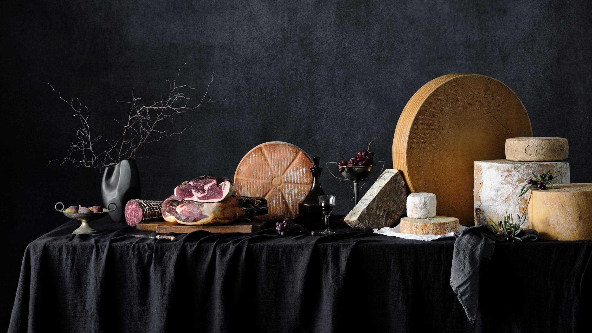
Savour & Grace
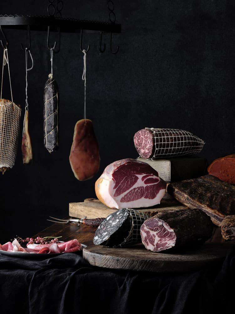
Savour & Grace — Fine Art Print Commission
Client: Savour & Grace, Melbourne
Commission: 5 large-scale fine art prints for office interior
Category: Food and still life photography, fine art printing
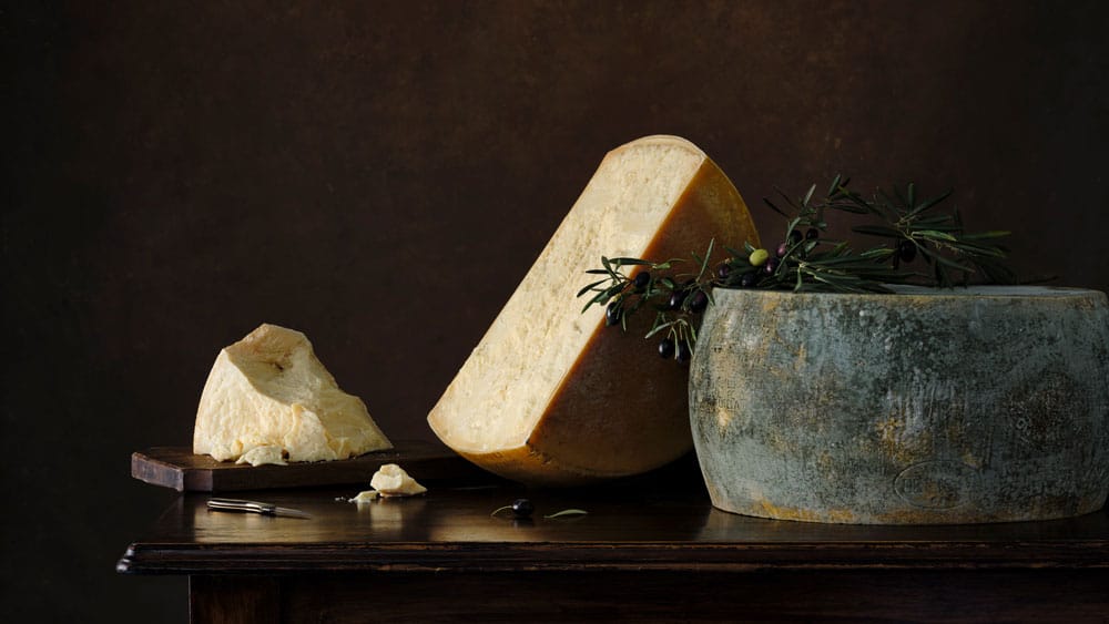
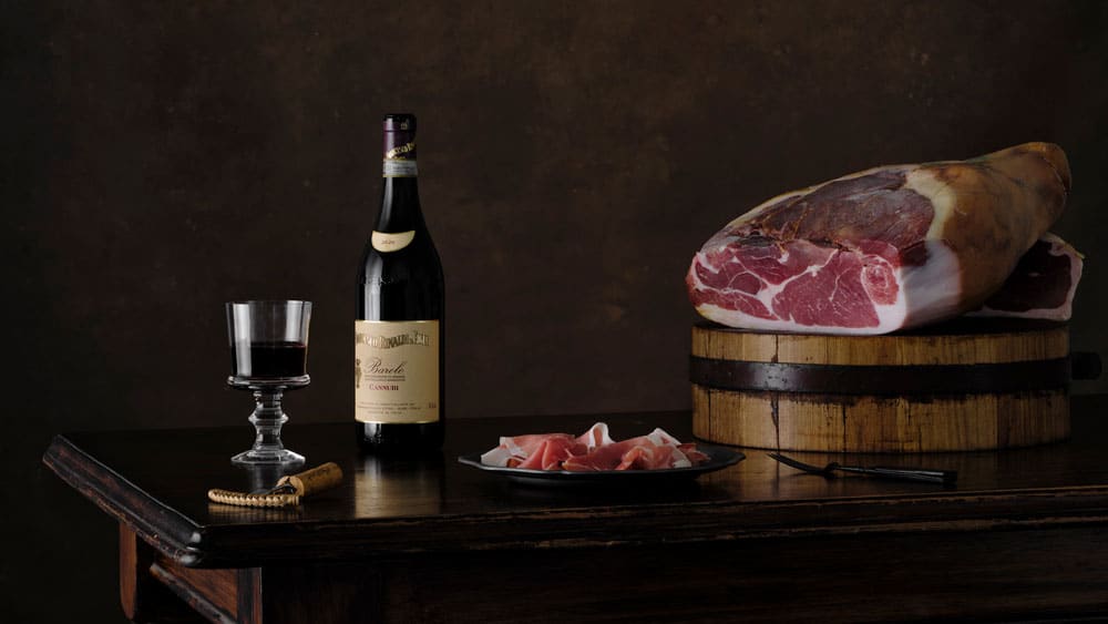
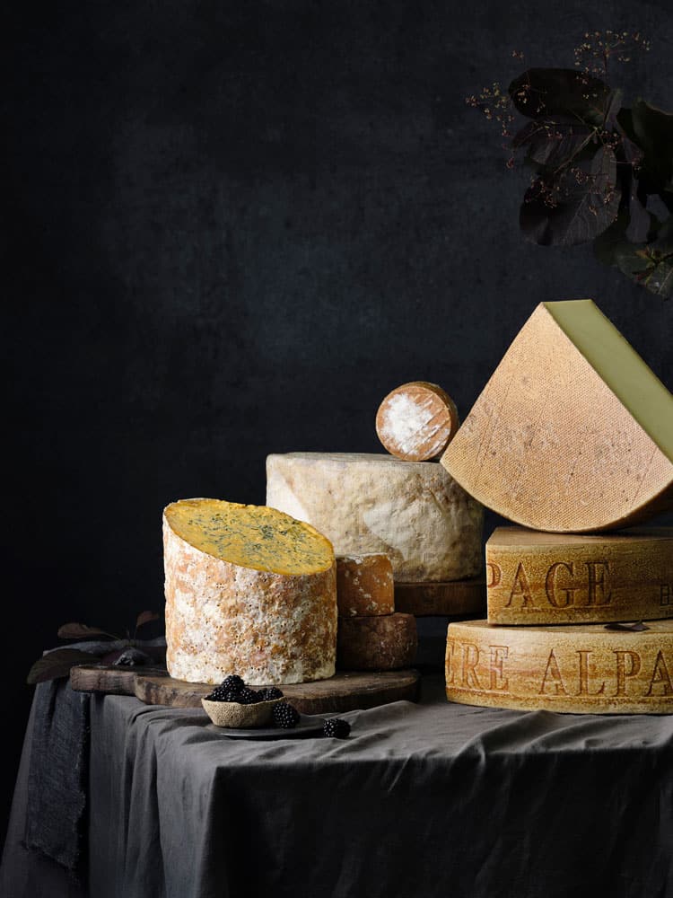
Savour & Grace is one of Melbourne’s most respected specialty food importers, supplying premium charcuterie, cheese and preserved artisan foods to hospitality professionals and fine-food retailers across Victoria. Since 2011 they’ve built the business on an unwavering commitment to quality — sourcing from benchmark producers across Europe and Australia.
The brief was to commission five large-scale fine art prints for their office space. Rather than generic wall art, they wanted imagery drawn directly from the products they represent — something that could express the character of their business every day in the spaces where they work.
Each image was conceived as a standalone piece, designed to hold at scale. The approach was painterly and deliberate: dark tonal backgrounds, considered composition, and light that gave weight and presence to the subject — the dense grain of aged parmesan, the colour depth of dry-cured salumi, the fine marbling of prosciutto. These are ingredients that reward close attention, and the images were made to do the same.
Working at the scale required for large-format printing meant every detail mattered from the outset — the way light fell across a surface, how negative space would breathe at size, and how each composition would sit within its environment rather than simply on it.
The five prints were produced as a coherent series: distinct as individual works, but unified by tone, palette and a shared sense of restraint. For a business whose identity is built on the quality and provenance of what it sells, the imagery needed to carry that same conviction.
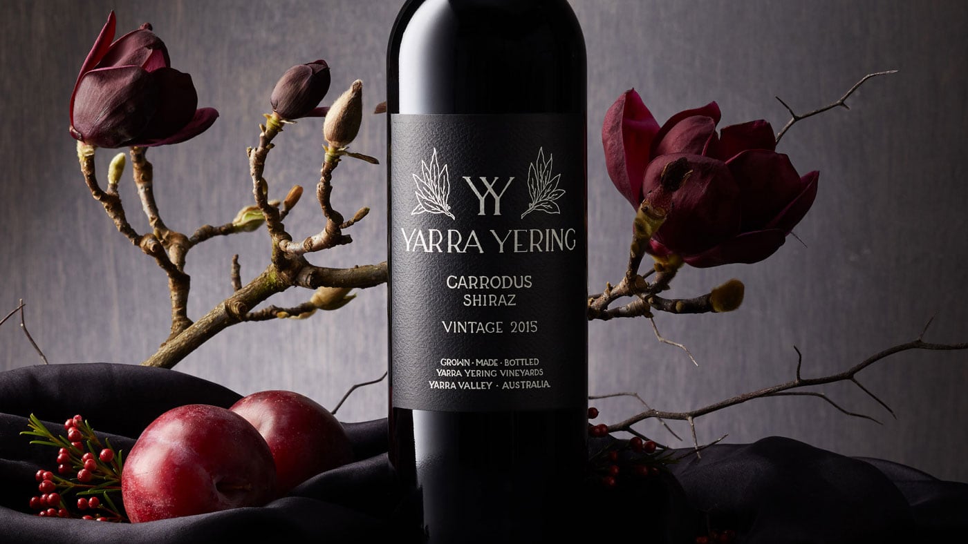
Yarra Yering
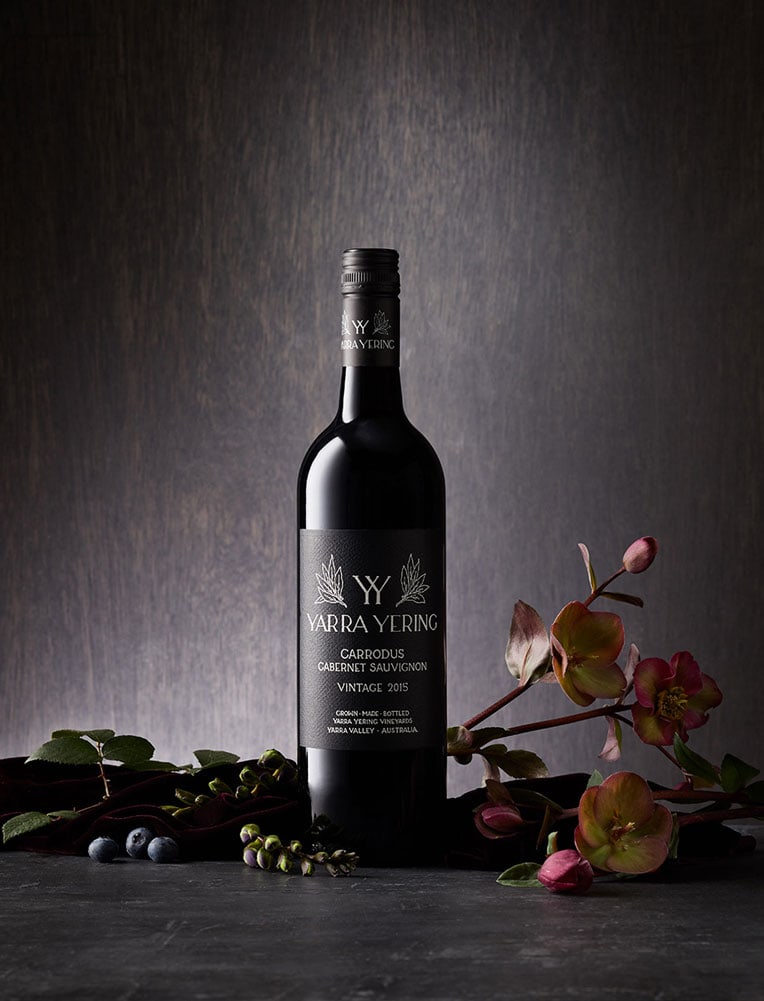
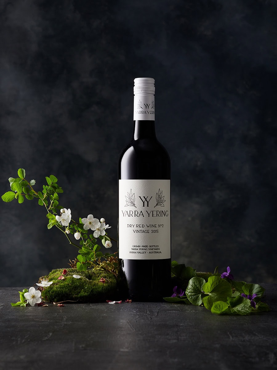
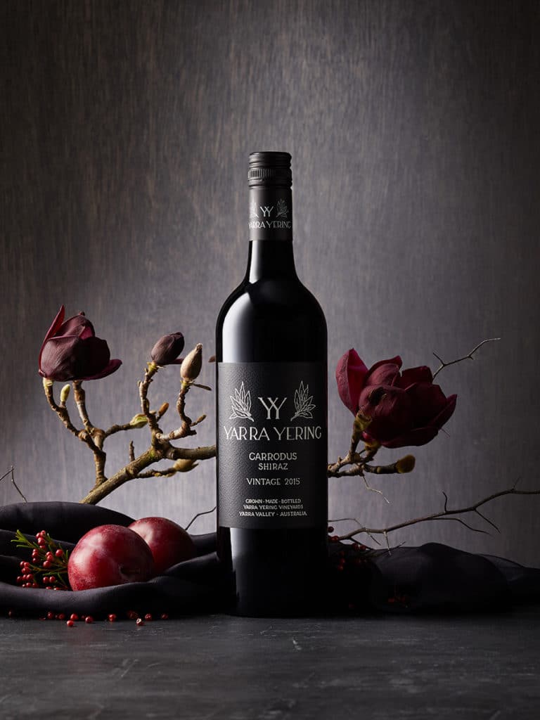
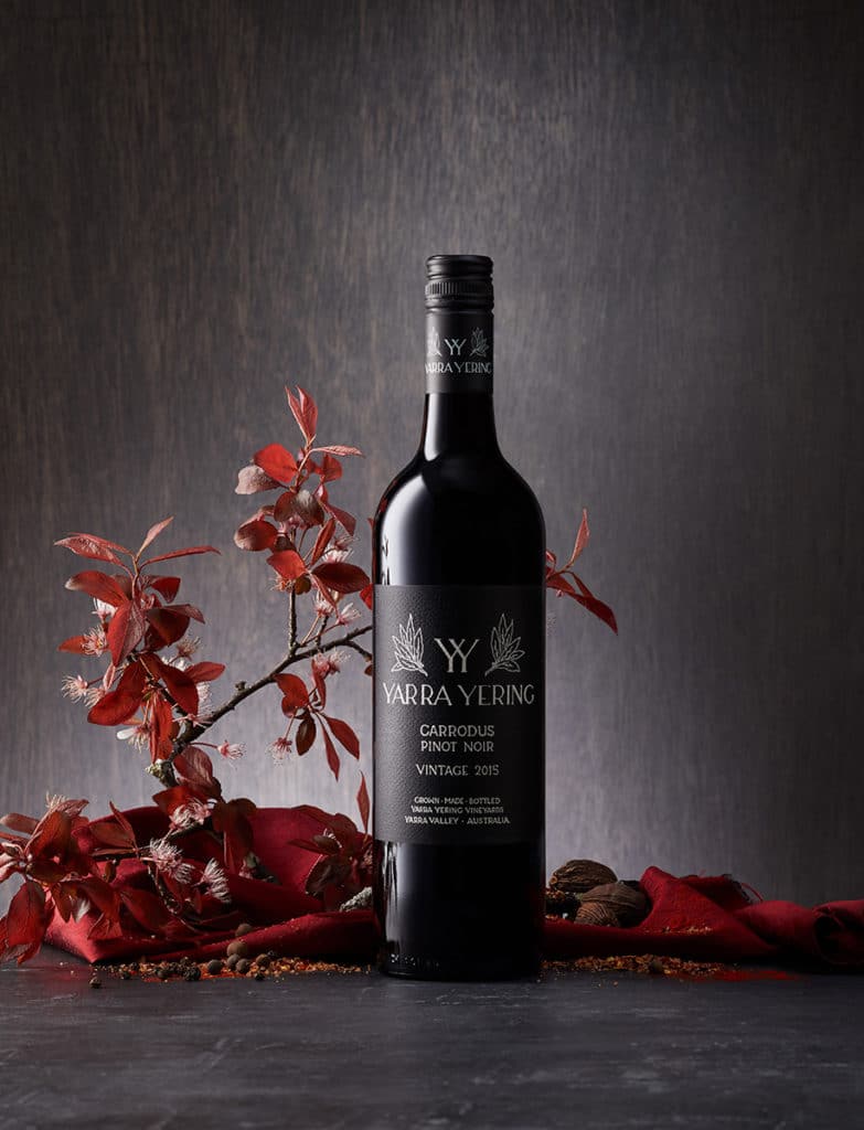
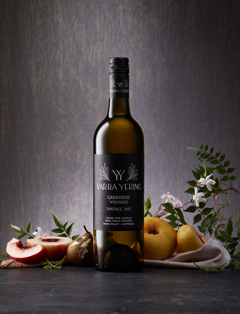
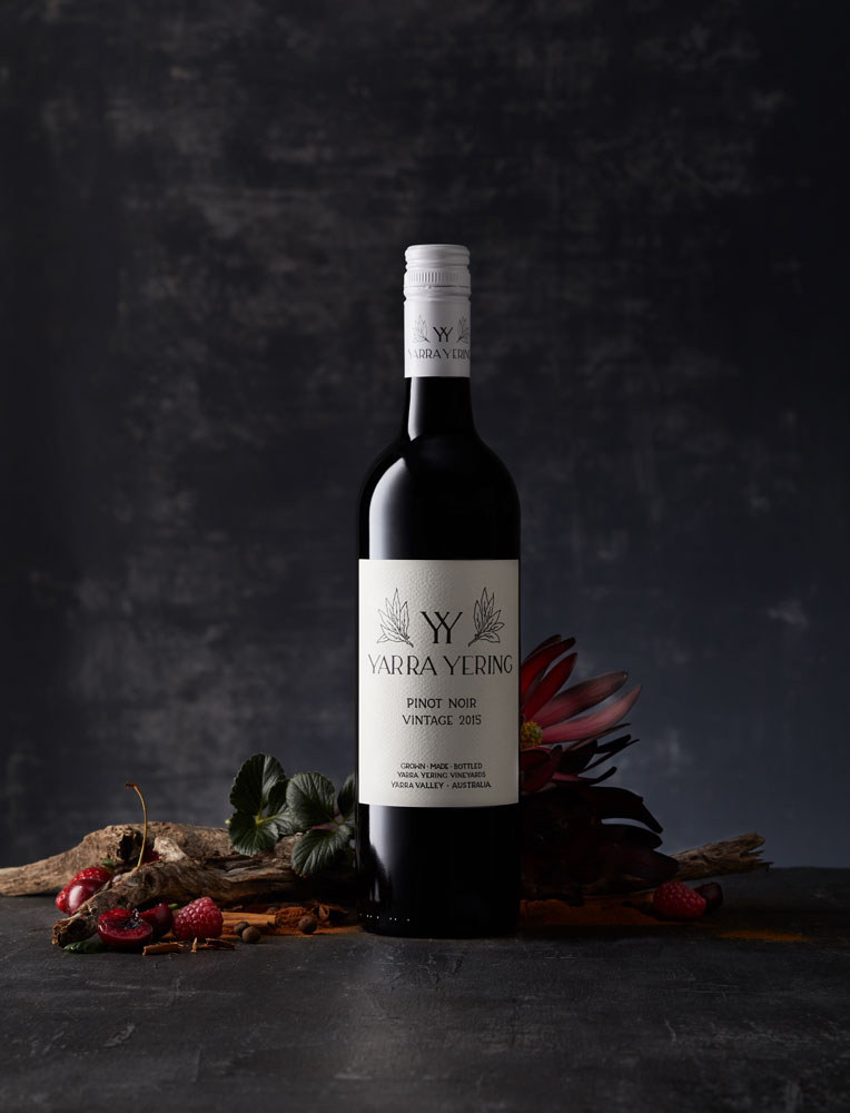
Wine Bottle Photography for Yarra Yering Winery in the Yarra Valley
Yarra Yering commissioned me to photograph their complete range of 13 wine varietals for website, media and advertising use. With a strong run of recent awards behind them, they wanted imagery that matched the quality and distinctiveness of each wine — more editorial than a standard product shot. Working with stylist Amanda Luck, we built each setup around the tasting notes for each varietal, sourcing botanicals, food elements and surfaces that reflected the character of the wine.
Wine Bottle Photography for Yarra Yering Winery in the Yarra Valley.
Yarra Yering’s brief was to photograph all of their 13 wine varietals and create imagery that could be used on their website, as well as print and digital advertising.
They had recently won several awards and were in need of some impactful product imagery that they could send out to media as well as continue to use to promote their wines.
Yarra Yering had provided a list of tasting notes for each wine to create a story around each of the different varietals. We worked with a stylist to develop this and she sourced a variety of food, botanicals and other elements to represent the flavour notes of the wines.
Styling Amanda Luck
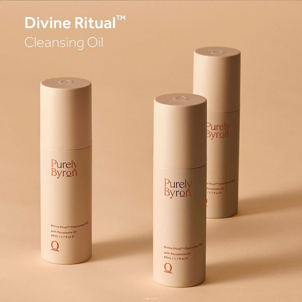
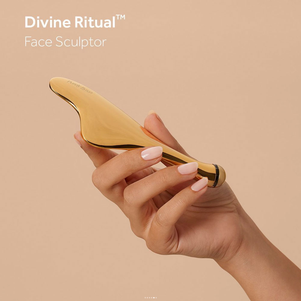
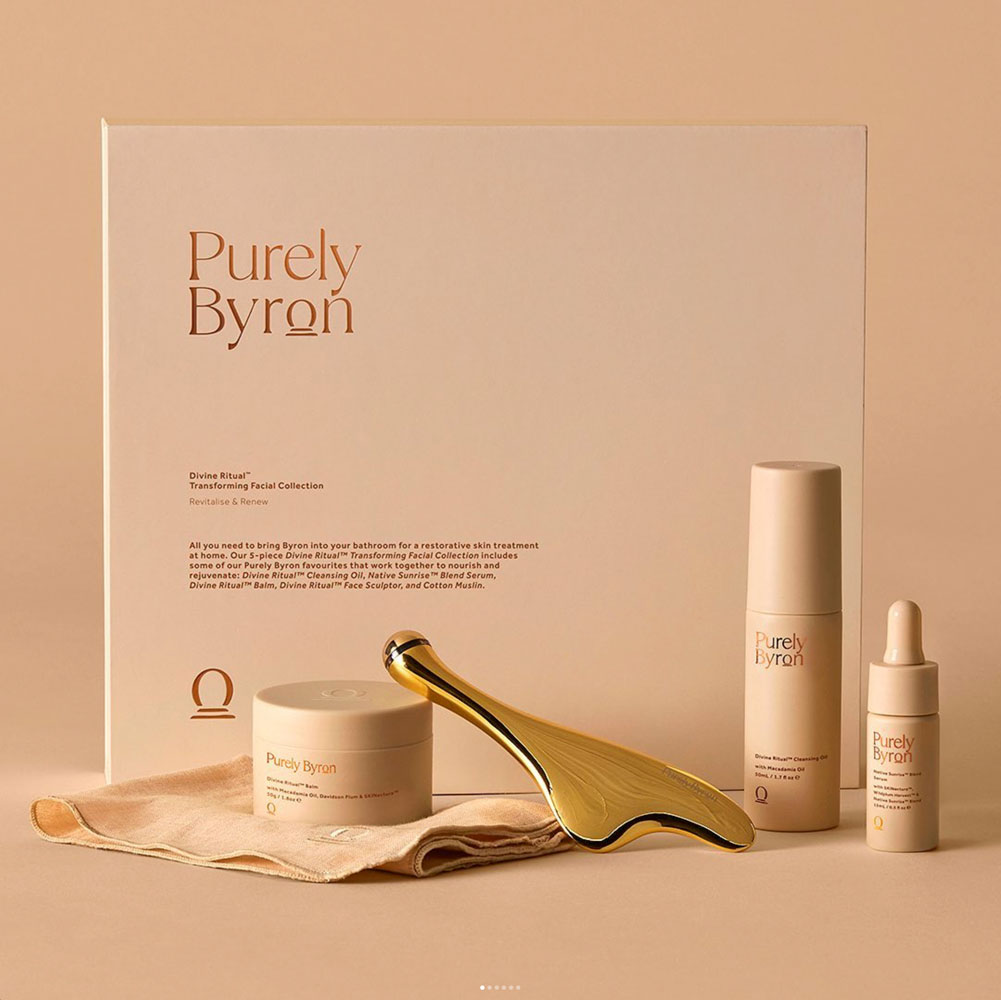
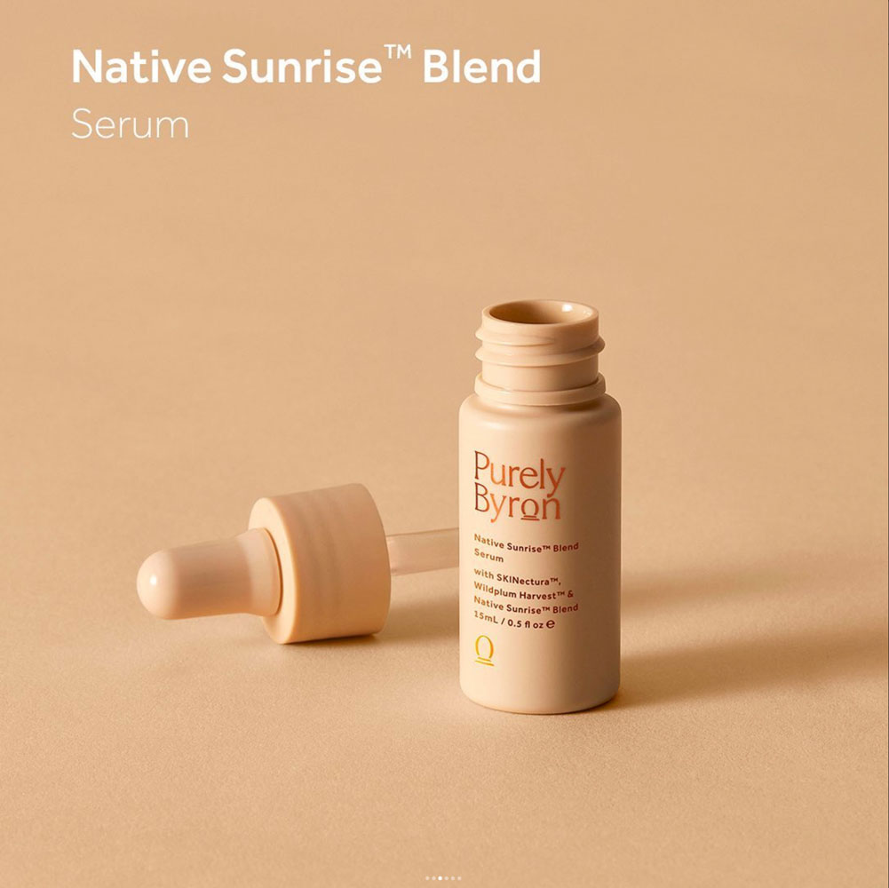
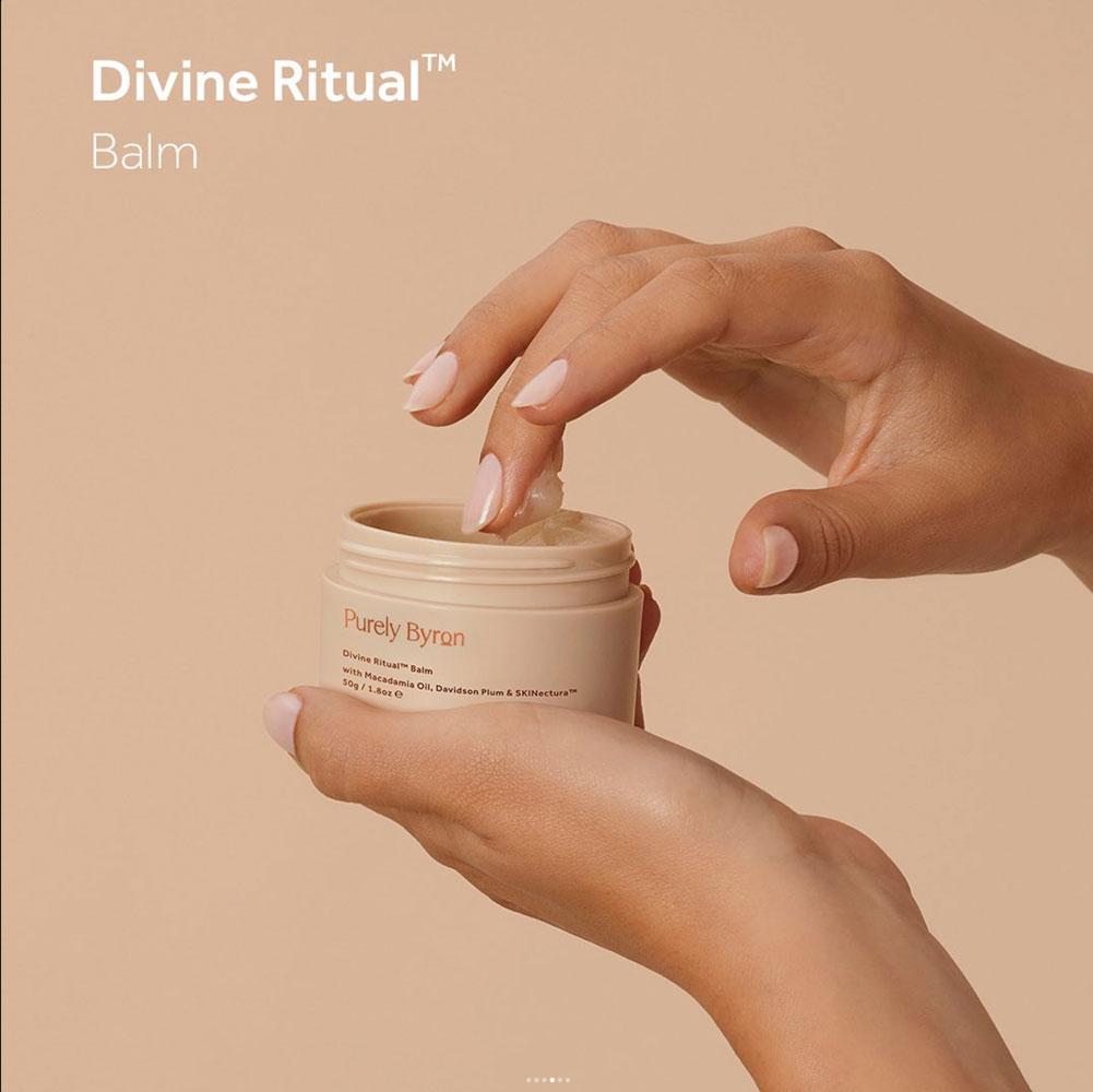
Purely Byron
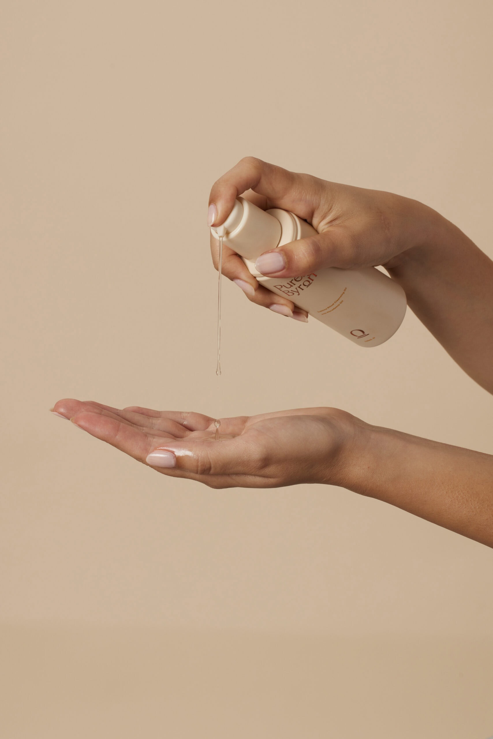
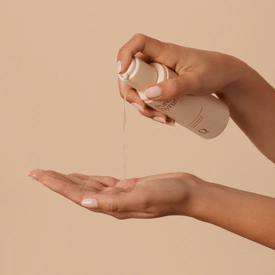
Project: Purely Byron | Brand Launch Photography
Project: Purely Byron | Brand Launch Photography
A comprehensive skincare product photography project commissioned for the launch of Purely Byron, a new brand inspired by the natural beauty of Byron Bay.
The Brief: To develop a complete visual library for the brand’s multi-platform launch. The photography needed to capture the brand’s core ethos: natural, eco-conscious, and rooted in Australian botanicals, while feeling premium and aspirational.
Our Approach: Working closely with the design team from Mustard Creative the project was executed in-studio over several days, allowing us to meticulously craft both product and lifestyle imagery.
- Product Photography: We focused on clean, minimalist compositions that highlighted the elegant packaging and unique textures of the skincare. Lighting was kept bright and soft to convey efficacy and purity.
- Lifestyle Photography: To evoke the “spirit of Byron Bay,” we used natural light, earthy props, and a warm, neutral colour palette. The goal was to create a mood of serene, natural beauty and mindful self-care.
The Result: We delivered a versatile and extensive suite of images that provided Purely Byron with a cohesive visual identity across their website, social media channels, and launch campaign. The photography successfully translates the brand’s story into a compelling visual language that connects with their target audience.
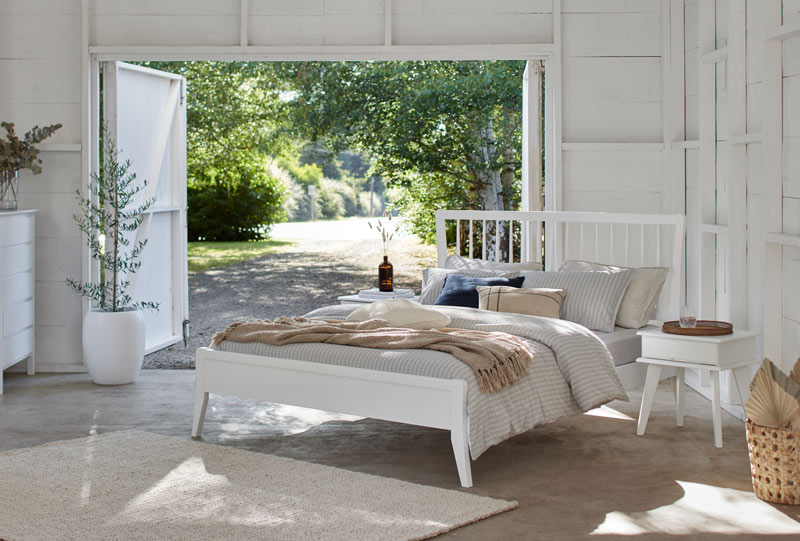
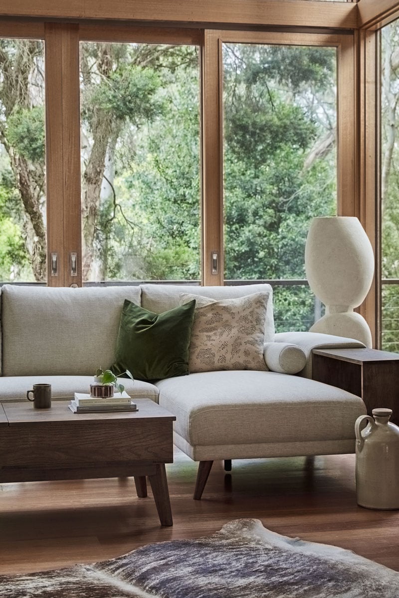
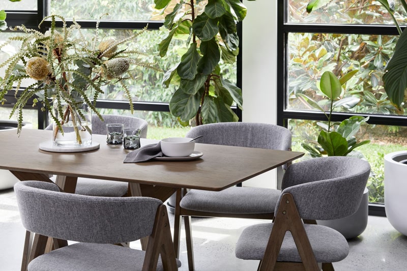
B2C Furniture - Summer 2022 Campaign
B2C Furniture — Summer 2022 Campaign
Client: B2C Furniture, Melbourne
Campaign: Summer 2022 lifestyle and campaign imagery
Usage: Online sales, digital marketing and social content
B2C Furniture designs and crafts sustainable hardwood furniture in Melbourne — pieces built to last, and designed to sit well in real homes and spaces. The brief for the Summer 2022 campaign was to create a series of lifestyle images that showed the furniture living and breathing in its environment, rather than isolated on a white background.
The shoot ran across several weeks and took me to three locations across Victoria: The Estate at Trentham, Fisher House in Warrandyte and Casa Warrandyte. Each location was chosen for its light, its relationship to the outdoors and its ability to give the furniture a credible, aspirational context — spaces that felt lived-in rather than staged.
The approach was environmental and unhurried. Natural light was the primary source throughout, supplemented where needed to maintain consistency across the series. Each setup allowed the furniture to be the quiet focal point — present and purposeful within a broader scene rather than demanding attention.
The resulting image library was created for B2C Furniture’s online sales channels, digital marketing and campaign use — a cohesive set of images that could work individually or as a series across multiple formats and platforms.

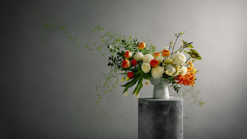
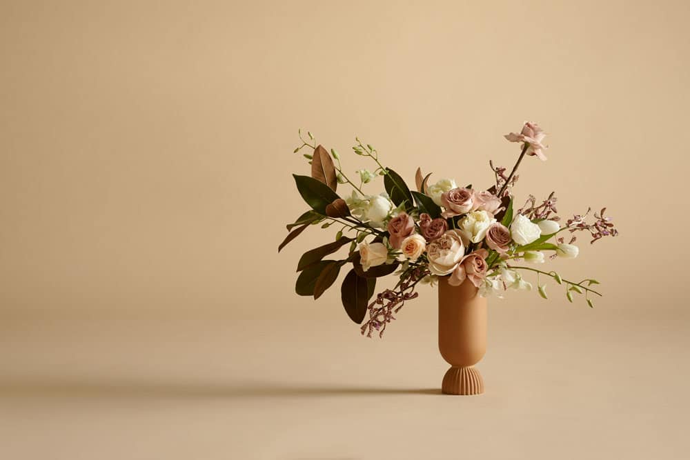
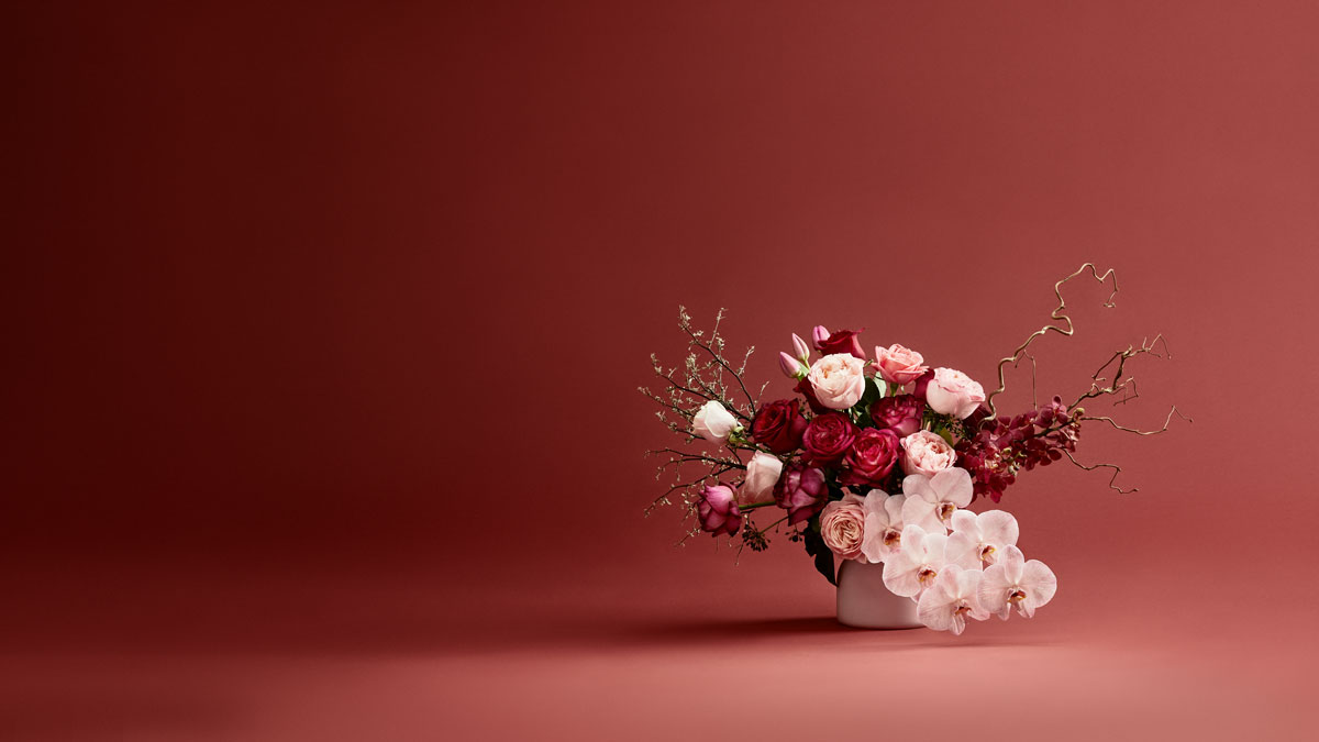
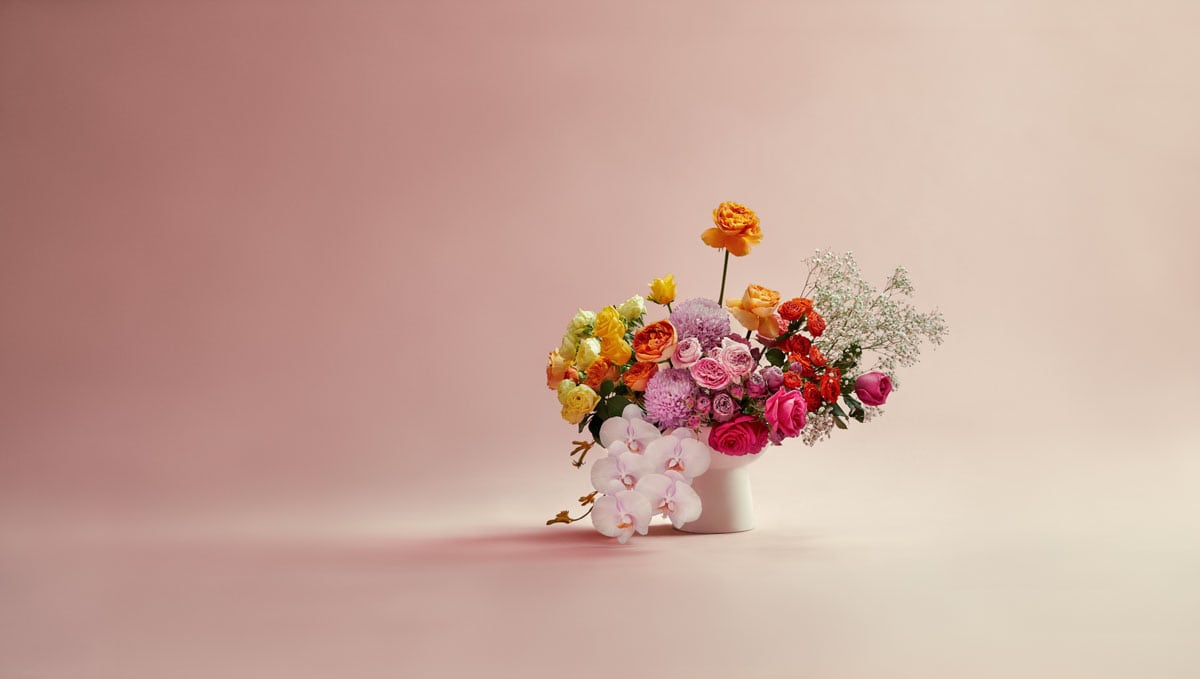
Flowerdose
Boutique Florist Branding & Website Photography – Flowerdose
Boutique Florist Branding & Website Photography – Flowerdose
I was commissioned to create a series of still life photography images for Flowerdose, a boutique Melbourne-based florist, to visually connect their newly designed website with their store aesthetic and branding. The project focused on crafting high-quality floral photography that would seamlessly integrate with their brand identity, establishing their digital presence while maintaining a cohesive visual language across all platforms.
Over the course of three days in the studio, we meticulously photographed around 100 product images for the website, along with eight hero images for the landing page and category banners. These images were designed to highlight Flowerdose’s signature floral arrangements, capturing their timeless elegance with a contemporary edge. The use of still life photography techniques allowed us to create images that are not only visually striking but also convey the depth, texture, and delicate details of each floral composition.
Collaborating with a photographic stylist with a background in floral design was essential to achieving the desired outcome. Their expertise ensured that every bouquet was styled to perfection, allowing the floral photography to emphasize the natural beauty, structure, and form of each arrangement. Careful lighting and composition techniques played a crucial role in enhancing the depth and dimension of the images, making the flowers appear as vivid and lifelike as possible.
A key aspect of the project was selecting color themes that aligned with Flowerdose’s branding while also reflecting their core product categories, such as “Roses and Romance,” “Celebration,” and “Sympathy.” These carefully curated palettes helped to create an emotional connection with customers, ensuring that the floral photography was both aesthetically appealing and commercially effective.
The final collection of still life photography and floral photography images serves as a cohesive and beautifully curated representation of Flowerdose exceptional floral artistry, aligning their brand storytelling, website design, and in-store aesthetic.

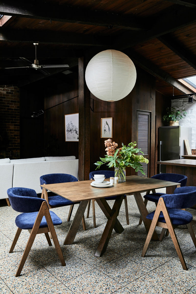
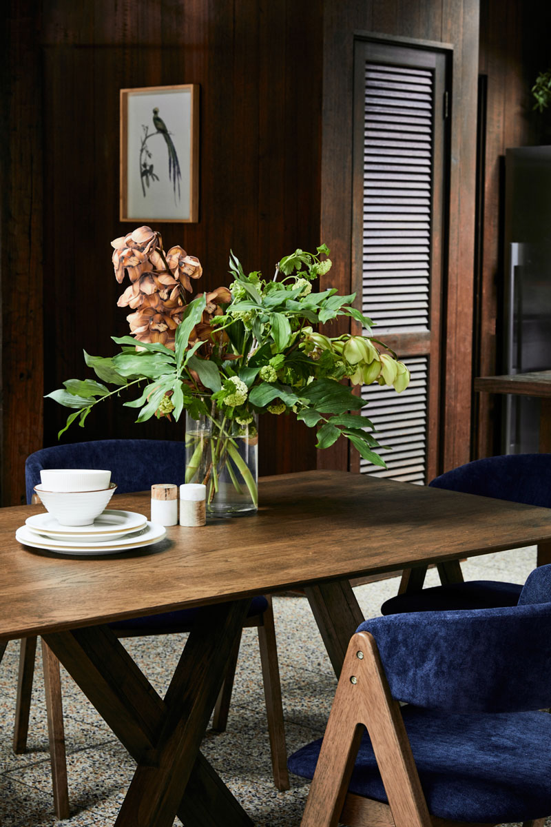
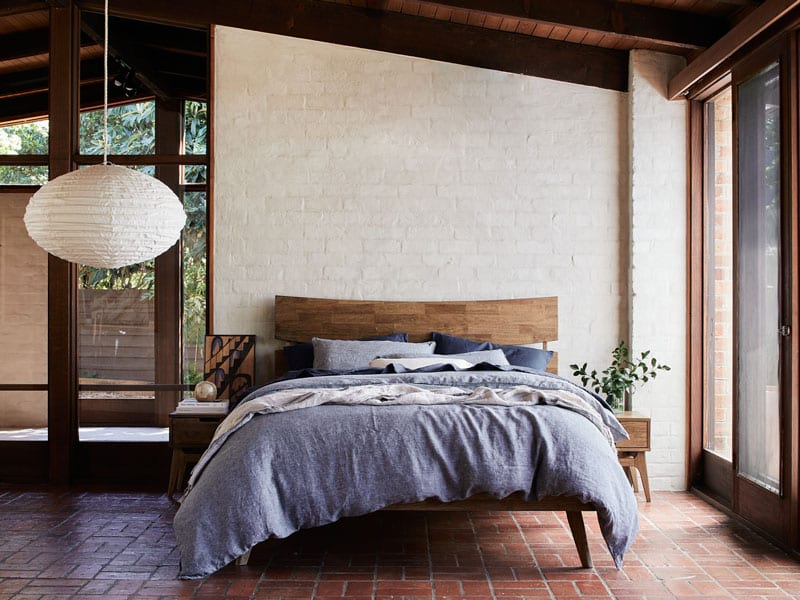
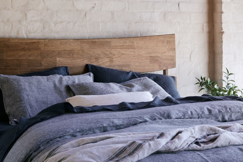
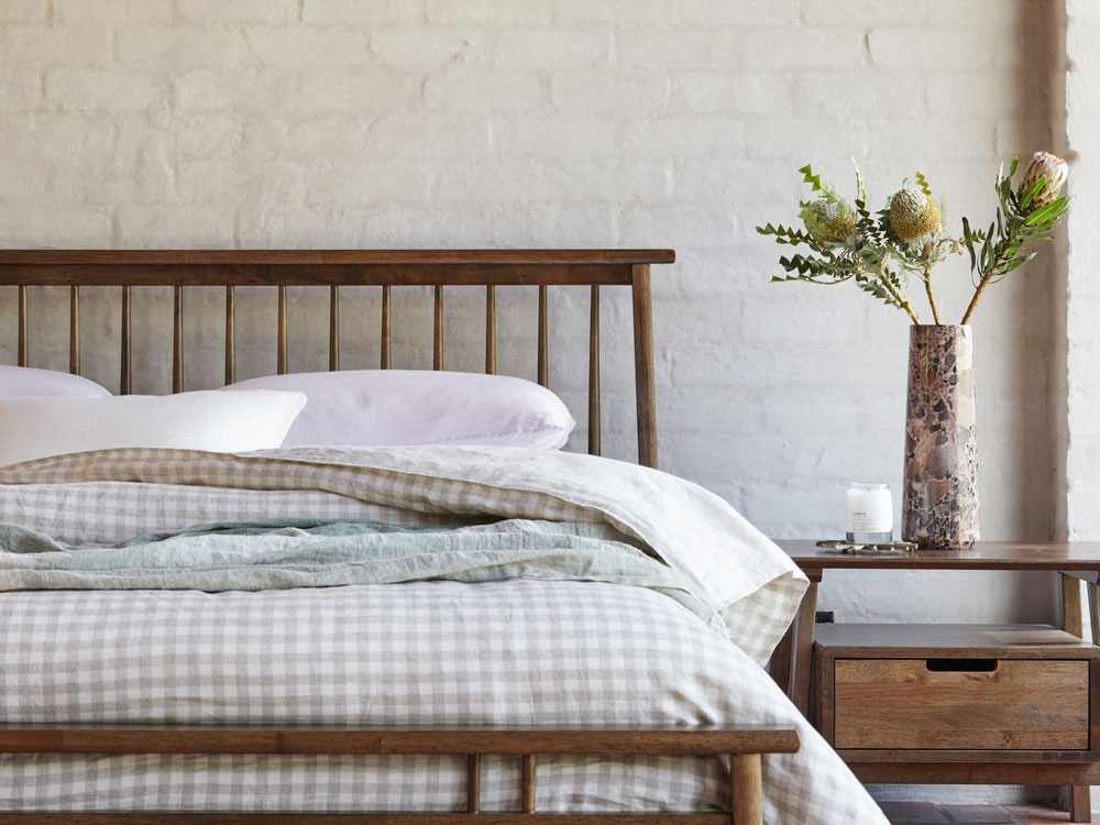
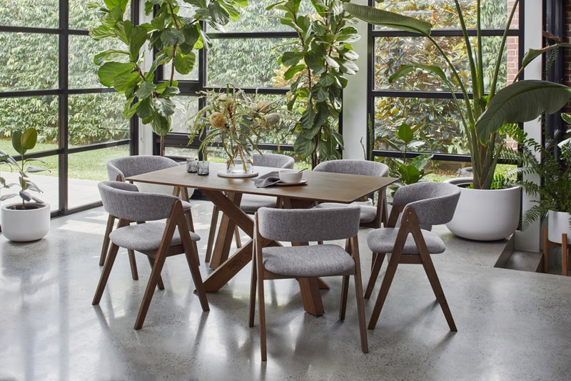
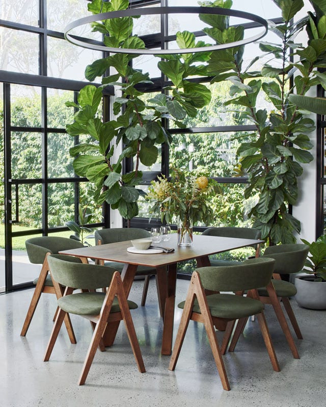
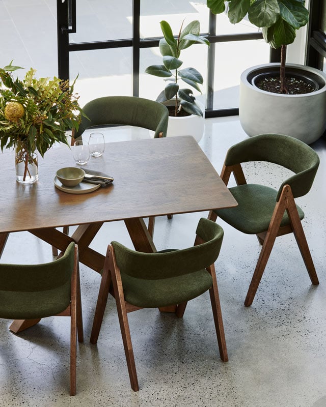
B2C Furniture - Casa Warrandyte
B2C Furniture Campaign – Casa Warrandyte
For this campaign with B2C Furniture I photographed on location at Casa Warrandyte — a home in Melbourne’s leafy east that suited the brand’s aesthetic well. The shoot ran across two days, working with the home’s natural light throughout. The brief was to create a series of natural, inviting images that felt grounded in the same values as the furniture itself: crafted from ethically sourced materials, built to last, and honest in its design.
B2C Furniture Campaign – Casa Warrandyte
This campaign for B2C Furniture was photographed on location at Casa Warrandyte, a home that perfectly embodies the brand’s values of timeless design, craftsmanship, and conscious living.
The brief was to create a series of images that felt natural, inviting, and grounded in sustainability—celebrating furniture made from ethically sourced materials and built to last. Working with soft, natural light and a neutral palette, each scene was styled to highlight the warmth of solid timber and the honesty of timeless design.
Shot in Melbourne’s leafy east, the imagery captures a sense of calm and connection to nature, aligning with B2C’s commitment to responsible production and furniture that doesn’t cost the earth.
Client: B2C Furniture
Location: Casa Warrandyte
Photography: Hannah Caldwell
More Interior Photography